In the realm of graphic design, precision and attention to detail are paramount. One crucial element that designers must grasp is “bleed.” If you’ve ever wondered what bleed is and why it matters, this comprehensive guide will illuminate all aspects, leaving no stone unturned.
Understanding the Basics:
What is Bleed?
Bleed refers to the extra area beyond the edge of the printed material that extends the artwork, ensuring it reaches the very edge of the final cut. When designers create a layout that extends beyond the trim area, they add bleed to accommodate any potential inconsistencies during printing and trimming.
The Importance of Bleed:
Bleed plays a critical role in graphic design for various reasons:
- Avoiding White Borders: Without bleed, printed materials might have unsightly white edges if the trimming is even slightly off-center. Bleed ensures that the design extends to the edge without any gaps;
- Accommodating Inaccuracies: Printing and trimming processes can be imprecise. With bleed, slight misalignments won’t ruin the intended visual impact;
- Professional Aesthetics: Bleed gives designs a polished and professional appearance, elevating the overall quality of the finished product.
How to Add Bleed to Your Design
Adobe Photoshop:
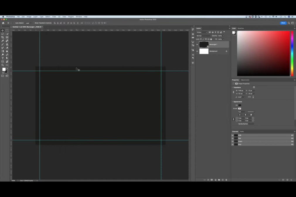
To add bleed to your design in Adobe Photoshop, follow these steps:
- Open Photoshop and click on File > New…;
- Enter the dimensions for your design, including the additional 1/4″ bleed both vertically and horizontally;
- Set the Resolution to 300 pixels/inch;
- Make sure the Color Mode is set to CMYK.
Adobe Illustrator:
To add bleed to your design in Adobe Illustrator, follow these steps:
- Open Illustrator and click on File > New…;
- Enter the trim dimensions in the Width and Height boxes. For example, a standard business card would have trim dimensions of 3.5″ x 2″;
- Enter 0.125 for the top, bottom, left, and right bleed;
- Set the Color Mode to CMYK;
- Adjust the Raster Effects to High (300ppi).
Adobe InDesign:
To add bleed to your design in Adobe InDesign, follow these steps:
- Open InDesign and click on File > New > Document…;
- Enter the trim dimensions under Page Size. For example, a standard business card would have trim dimensions of 3.5″ x 2″;
- If you do not see “Bleed and Slug” at the bottom of the window, click the “More Options” button;
- Enter 0.125 for the top, bottom, left, and right bleed.

Best Practices and Tips:
1. Maintain Safe Zones:
Even with bleed, it’s essential to keep critical elements, such as text and logos, within a safe zone, well inside the trim area. This precaution prevents crucial information from being accidentally cut off during trimming.
2. Use High-Resolution Images:
For bleed to work effectively, ensure all images used in the design have a high resolution. This safeguards against pixelation when the artwork is extended into the bleed area.
3. Check Printer Requirements:
Different printers have varying bleed specifications. Always verify the printer’s requirements before finalizing your design to ensure compatibility.
Bleed vs. Margin: Understanding the Difference:
One common source of confusion is the difference between bleed and margin. Let’s clarify:
| Aspect | Bleed | Margin |
|---|---|---|
| Purpose | Ensures design extends to the edge of the paper | Creates space between content and the edge |
| Location | Outside the trim area | Inside the trim area |
| Design Element | Part of the background | Part of the main content |
| Printed Result | Trimmed off | Visible in the final product |
Conclusion:
In the vast landscape of graphic design, understanding the concept of bleed is indispensable. It paves the way for professional-looking materials that captivate audiences and leave a lasting impression. By incorporating bleed correctly, designers can elevate their work to new heights and achieve remarkable results.


